Thursday, October 23, 2008

Survey


I got some problems with my pictures for my survey (see above and below)


Well I had some problems with the size of the pictures. Using photoshop it didn't go well. But when using paint I get quite satisfied pictures.

For my survey you can watch it on:
http://www.surveymonkey.com/s.aspx?sm=yb8wbyBRt97CiOP7rAzx5w_3d_3d
But I need to say that it is still a test version at this moment.
I like to know your opinion about it. Because the little time there is left I think I am not going to change it that much.

Wednesday, October 22, 2008

Progress of week 7 and 8

Last week I tried to render my model. I still had many problems with the noise in the pictures. During the weekend I made some renders with a render time of 2 hours, still there was to much noise. Because of the time I thought to go on with the noisy pictures, but it keeps annoying me.
On the Maxwell forum I was reading many topics. Eventually I saw an problem of some1 with similarly problems. He had made some interior renders. Probably it is difficult to render interiors. He got also noisy pictures. Many people discussed about the problem and told all kind of tips, tricks and suggestions. Mostly didn't work by him, but it helped me to understand more of Maxwell.
Some things were:
- Many emitters (lamps) with multilight can infect the needed render time.
- Using a "flash" behind the camera

When changing some things in Maya I made some renders again. Then the renders were getting better then before.
When making the survey I saw some problems for the survey.
- With a free account I can only make 10 questions, but when using an image that counts as a question. That is the reason why I going to use several pictures in one.- When uploading an image it can be only 150kb. So I need to compress some images, but when I put several images in one image the size is going to be too big.
- Solution for this problem is to upload the images somewhere else. And use that link for the image.

I want to make my survey easy to fill in with easy and short questions and answers.
To have a survey, which can be analyzed, I will only use multiple choices with only 1 answer.
The answers of the questions will tell me, if the psychological feelings can be adjusted by using colored light.
- Questions about psychological feelings of space and dimension.
- Questions about psychological feelings of space and mood.


Here some new renders:


Wednesday, October 15, 2008

Progress last week

Here below is the presentation I present last monday. It was not a final presentation, but a presentation of what I did last weeks.


6 october 2008

Today I was not present on the meeting.At this moment it was not going that good with my project.
The main problem is, that Maxwell is not installed on the computers in the TENT's. On the presentation (3rd of October) Axel thought it was already installed, but Paul told me it was not.
I mailed Paul de Ruiter that week and he ensured me, that some people should installed the software.I mailed him back, with the question on which computers maxwell is installed.
But they were not installed yet. He should let me know when maxwell is installed and on which computers. During the week I did not get an email from Paul, so the software Maxwell is still not installed on computers.

Then I thought, I have to go on, because otherwise I would get in some time problems.I was thinking about other plug-ins, suddenly I saw that I could use Maxwell via MAYA. I was using the plugin for MAYA and it works! But during the weekend and last night I tried to figger out, how it works. The problem for me is, that I never had used maya often, so I don't know exactly how to use the materials. For every material I imported an .mxm file. For the lights I used an Emitter (saw this in the manual maxwell plugin for MAYA) Then I made a render. Thirst there were problems with no light. Later I get a blurry image, but it is an image. Then I changed several aspects and was playing with the light and materials. The render staid blurry, maybe the scale is not good. But still I don't get the effect of light I wanted.

(10 october) I am not sure what to do... I do not have that much time. Maybe I am at the good way.I still didn't get a mail from Paul, so I think Maxwell is still not installed.I think I need help for rendering, I thought it should be much easier. But should I use MAXWELL in MAYA (or rhino) or should I use other plug-ins? (I heard some plugins like Kerkythea are more easy to use? but maybe it is MAYA that it seems to be hard to use)I know Axel got maxwell with Rhino, maybe he can help me made some renders, but than it need to be done in a few hours and I think that is not going to work.

Now it is blurry in my head. I hope Axel can help me with my choice, what to do now.
- Go further with MAYA and maxwell
- try to use other rendering software
- use maxwell and rhino, if it is installed on computers in TENT 3

Thursday, September 25, 2008

Progress

Last monday we had a meeting with Axel. Because he was alone we didn't had much time to talk invidual to Axel about the progress. But I didn't had that much progress to show him, because he already saw at my blog my idea and gave comments on it.
The comments were to use Maxwell render and a handy survey tool is http://www.monkeysurvey.com/.
He showed me quickly how maxwell worked.

So for me was the order to explore how the monkeysurvey works and to go further with my Rhino model and use maxwell render.

I have made a test survey and I know how it works, I can even put images on it, what is important for my survey.

I am busy with my Rhino model. But I still cannot use maxwell render. I talked with Paul de Ruiter about maxwell and he said that there were some license for maxwell, but they could be lost in the fire. So I send him a reminder to search for the license, otherwise he should order some new license. But at this moment he didn't mailed me yet.
An option is to download the Demo version of Maxwell, but I can't install them at the computers of Bouwkunde. I will try this at home, because I need some trial renders for the presentation of mondays.

Thursday, September 18, 2008

The Idea and Goal

Idea:

I have been thinking about my plans and especially my goal.
Now I want to create a space, with in that space smaller spaces with differend dimensions, textures and arranging of (construction) objects. These parameters can influed, besides color, the psychologial moods of the people.
The space will be designed with a 3D model program like Rhino and Maya.

Goal:

The idea is to place some lighting fittings on the walls and ceilings. I take a several positions for the camera to render. Then I want to give the light of the lighting fittings differend colours and intensity. Of each colour I make a render. Then the renders, with each colour, of each camera position will be compared. I can imagen that a netly arranged space with symetrie and red light seemed much busier then using white or blue light. Maybe a space with a busy arrangement and iterrior and blue light can be experienced much more calm.
This is a start for the space where I want to project the colored light on. As you can see I want to create at the right a busy space and at the left a more calm space.

wednesday a bad day..

Yesterday I had misfortune. I was working (and at the same time chatting) on my laptop and thought it could be nice to drink a cup of coffee. So I made coffee, because the temperature of the coffee I placed the cup next to my laptop on the left side, otherwise there is a chance to push it off with the mouse. I wanted to take a swig, someone chatted to mo and I wanted to response, I put my cup before me and wanted to type........ bang.... I pushed with my hand the cup coffee over my laptop.... What a foolish action.. I tried do dry it with paper tissues and placed it in the sun. After a few hours I tried to turn it on... It worked and I was happy, because I expected it was damaged. So I told someone that it worked and at the sime time my screen turned grey. After a reset it worked again, but the harddisk was damaged. I did again a reset and it functioned quite well, but I needed to go.... The question is now: Will my laptop survive the coffee-test?

Tuesday, September 16, 2008

psychological effects of colour

Information from the book "LIGHT: The Shape of Space" by Lou Michel:
There are six primary colors, which can influence the psychological sens of the human mind.
Some psychologically effects are:
coldness and warmth
joy and sorrow
beauty and uglyness

the warm colors are:
- Yellow/orange
- Red
- Yellow/green

Cold colours are:
- green/blue
- blue
- violet

Red:
Red is not subordinate to any other colour. It is so dominant that it immediately takes over from other colours and stimulates the eye to the greatest extent. When set among other colours it looks as though it is much closer to our eye than the others, such as green or even blue, for example. Red expresses living power and energy. It symbolizes love and addresses the greatest range of human feelings. Heavy, dark red stands for dignity and burning seriousness.
Cardinal red is the colour of toppling, of overthrow. The brighter the red becomes, excitement increasingly retreats in favour of warmth and joy.
In the light hues in particular (pink), red is lighthearted, joyful and young.

Blue:
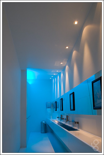
Blue is the colour of sky. The deeper the blue, the more metaphysical it becomes: blue-black has the note of overwhelming cosmic mourning. Blue is and always will be an enigmatic colour for us. It always seems distant and may be soothing, but still it radiates seriousness, cold and yearning, with an undertone of sadness.Blue makes a hole in the picture - says the painter - and this means that blue always seems to be drawing back. Ultramarine is also cool but has an agreeable, calming peaceful effect, because it behaves passively. Blue-green fuses blue's reticence and yearning with the peace and freshness of green.
Blue-green induces yearneing but is soothing at the same time.

Green:
Green, particularly the fresh green that is often called 'young' green, expresses spring and youth. Darker green loses this symbolic quality. Green is also the symbol of a full and healthy life. However, while orange expresses higher spiritual life, green stands for vegatarive, full bodily life.
Green is the most peaceful of all colours and can thus even out differences. Green attracts the eye, satisfies and invigorates it. If green is mixed with yellow, it becomes more youthful, more lively and more active. When mixed with brown it strikes a different note, becoming heavier and more serious.

Violet:
Violet is the most remarkable of all the colours. It is neither cold nor warm. Yet it has something mystical about it, something that can be depressing for some people and trigger a sense of malaise. Violet appeals to those who tend to be deep and mystical, sometimes even a little odd.
A particular shade of violet can make a profound impact on people, even move them. violet has an almost numbing effect on the very sensuous, and such individuals tend to avoid it. A violet in which blue is predominant is ruther enhanced in its tendency to the ethereal, to striving upwards (ultramarine).
Red-violet, in which the red strikes only a gentle note, becomes more delicat the more it is lightened. It then exudes a fefined delicate, 'feminine' aura. But dark violet-red is more dignified and becomes episcopal purple. Lighter shades of violet (lilac) combined with white and lemon-yellow can create a very intense and feminine effect.

Yellow
Yellow has a very stimulating effect, but without causing the kind of excitement we associate with red. Pure yellow is the brightest colour in the chromatic circle and symbolizes fertility, blessing, abundance, and - if raised to the plane of gold - it expresses power, glory and majesty. The brighter yellow is, the more it moves into the foreground. Yellow has a dominant effect. If it is divided, it increases in power. However, it loses its cheerfulness or majesty if it becomes darker. The brighter yellow gets the more it is refined, becoming less weightly, more delicate and more noble, and then optically more reticent.

Magenta:
Magenta is the colour of the unnatural and thus also of the supernatural and transcental. We see not only the superficial but also the broader context. We try to find out what lies beneath the surface and how everything fits together. Here we are dealing with order and justice, with matters of principle. Magenta can indicate abnormality but also an awareness of the special, or it can even suggest undue claims to power.

Brown:
Brown is the earthiest, densenst and most real of all the colours, Brown cannot be called noble and refined, but it is powerful, expressing health and solidity, earthiness. This very typical quality is changed when brown is mixed with other colours. When mixed with red or violet it gives the impression of sunshine on earth. This violet-brown then has a very attractive power, movin into the realms of magic and mystery.

gold:
as such, gold tends to be toneless and thus soulless, but its density and magnificent radiance give it a festive, majestic quality. Like the sun, gold expresses the highest life force, in spiritual terms. It also expresses power and dignity; the richter and more powerful the age, the more gold was used in the furnushings.

Silver:
like god, silver is toneless and soulless, but its radiance is quite different from gold. Like grey, it is assigned to coloured objects but lessens their joyful quality. Silver is not as enticing as gold; it does not dazzle the eye but attracts it gently.
It is said that silver is 'the light among the metals', and for this reason many people feel that it is nobler than gold. Gold radiates warmth, but silver always seems cool.

Black
Black equals absolute darkness, embodied as material. Black is serious, negative and dark, and sugest mourning. It is closed and sublime. Set against white it produces absolute contrast.

White
white is beyond good and eveil. White is also not a colour in the sense of chromatic quality. It is the strongest counterpole to black. The unconditional nature of this contrast is easy to understand. While black expresses mourning, white is associated with gaiety. For us, white symbolizes essentially simple but powerful and significant has to be expressed, this is best realized by the contrast between black and white.

Grey
grey is the essence of gloom. it could be seen as symbolizing indecision. Grey is indifferent, toneless, it neither warms nor cools. It is a background or secondary colour. Grey can balance and neutralize and thus plays an important part in moderating unduly great colour contrasts or bringing colour contrasts together harmoniously. Grey is like the pause in music.

Information from www.lighting.philips.com:
Highly satured colours mixed without white, black or grey creates powerful aggressive impressions and indicates force and might. They give strong moods

Colours created by light induces mood sensations, stimulates feelings and influences behavior.

A variation of colour and intensity lead to destressing.

Friday, September 12, 2008

Walter Gropius once said: "Creating moods is a task of education". I want to know more about colored light and their effect on moods.
The following sentences are from the book "Light: The Shape of Space" by Lou Michel. Light effects are optical illusions of psychological influences of shapes, colors and textures.

We don't see light, we just see the effect of light.
It's not the void, but the colored, textured and patterned planes on which the human eye fixates. As the quality and quantity of the lighting change and alteratings are made to surfaces of the dominant boundaries, so changed the mood.

Lighting alone can create conspicuous change in the appeareance of space. When the lighting is raised in a dimly illuminated room, it appears larger without any change having taken place in its physical size or the surfacing of its boundaries.
"To create architectural space then is not to design with light, but to design with the effects of ligth.

The Use of symmetry in the arranging of the floorplans, walls and ceilings can give calmness.
Think about the human scale of the space and the amount of light.


Wednesday, September 10, 2008

Results of the presentation of last monday

Monday we had a meeting with the research tutors, Axel and Rudi.
Every student was holding his presentation with his research hypothesis.
After the students proposol, the tutors gave comments and advices about the proposol.

For my proposol I get the following comments and advices:

- Looking for phsycological effects of the colors.
- Searching on the internet and in the literature
- Health healing with light (researches of hospitals)
- Truus knew a PhD-student who did research to psychological of colours.
- Axel knew a PhD-student who did research to LED-lights that had to do with,
to tune the color of the LED for each toner. So that you can get every color you want.

- Do research of how I want to use the light in the space.
- diffuse light, spotted light or reflected light.
- artificial light or natural light.
- What kind of space do I want to make and with what measures.
- Design a space.

- They recommended to look for designs of Alvar Aalto.
- He used natural daylight in his buildings.

- Karel suggested not only use light but also using sound.
- Sound can manipulate the psychological human feelings.
- They told me to do research for a building in Brussel, designed by Le Corbusier for the Brussels World's Fair of 1958.
There is a video on youtube of the "Poème électronique" that was played in the building.http://www.youtube.com/watch?v=rC3OXai7W9I

Christian send me a mail with precedents that could be interesting:
- Ambilight TV's From philips
- The shoebaloo from Meyer en van Schooten architects

Some notices for myself:
- It is important to know what I want to do.
- Do I want to use the sound-issue in my space?
- How should I develop the model?
- Try to figger out what approuch I need to get my final result.
- Which computer programs do I need?
- It is not just reproduce and do research!

Friday, September 5, 2008

Search for a research

Search for a research

I have always been inspired of light, fireworks, laserhows and the commercial sign as on Times Square. So I can say: “I like colored light”. When visiting architectural buildings at night, you get a totally different feeling, then when you visit at day. This is because of the composition between the dark surrounding and the lights shining at the building. When buildings are enlightened they can be noticed from a distance.

In the summer holiday there were the Olympic games of Beijing. I have watched most of the games. The architecture they used for the stadia was very impressive. Especially the “bird nest” and the “watercube”. During the closing ceremony the view from above the bird nest was imposing. It was dark all around the “bird nest” the light of this stadium, the fireworks and the “watercube” gave a special effect. I was inspired especially of the watercube.

Idea 1:
My first idea was to use electrical colored light in a façade something like the “watercube”. Then the light could change color when the environment changed, like changing of the weather or temperature. Or the colors are changing by movements of traffic or people.

Idea 2:
The first meeting I talked about the idea of using electrical light and he mentioned to create a room/corridor or something and to use colored light in the façade and researching the effe
ct on people when changing the color of the façade as walking further. Then notice what experience the people get. Or create a space with all different kind of heights and widths and investigate what the difference kind of light can create at the feeling in that space.


Tuesday, September 2, 2008

start of the academic year

Today we start with our academic year. At 10:00 AM I meet the other students and teachers of 'standup Architecture'.